Category
Surface design – corporate design
Date
September 2024 – January 2025
Used programs
Sketches by hand, InDesign, Photoshop, Illustrator
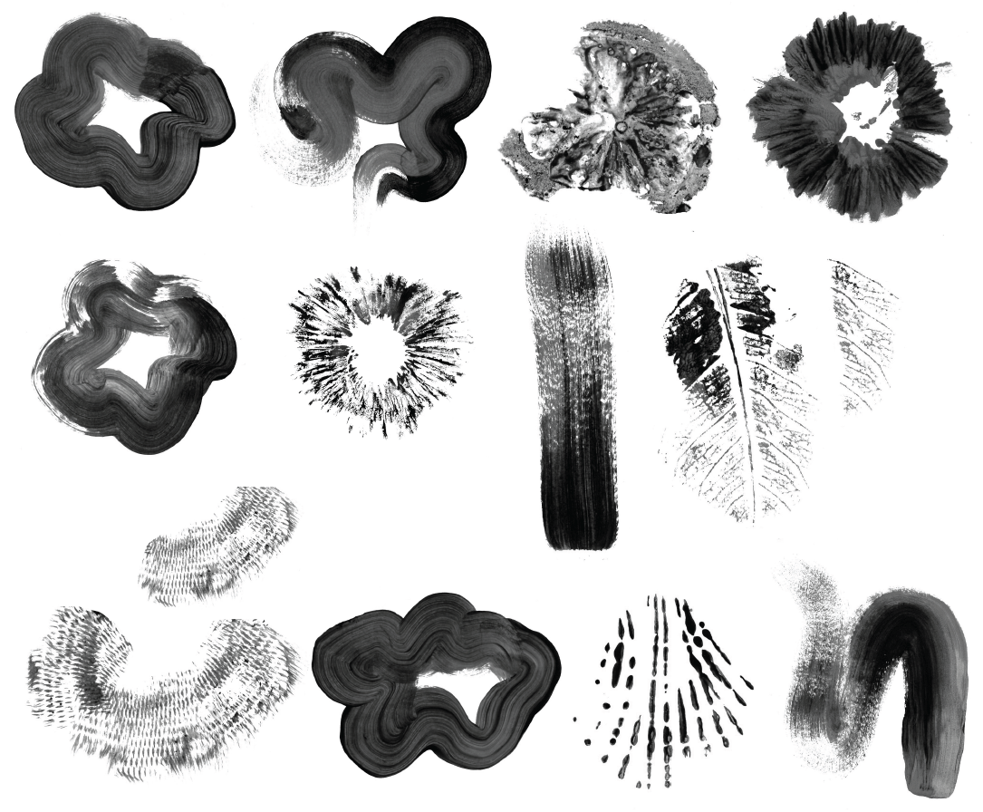
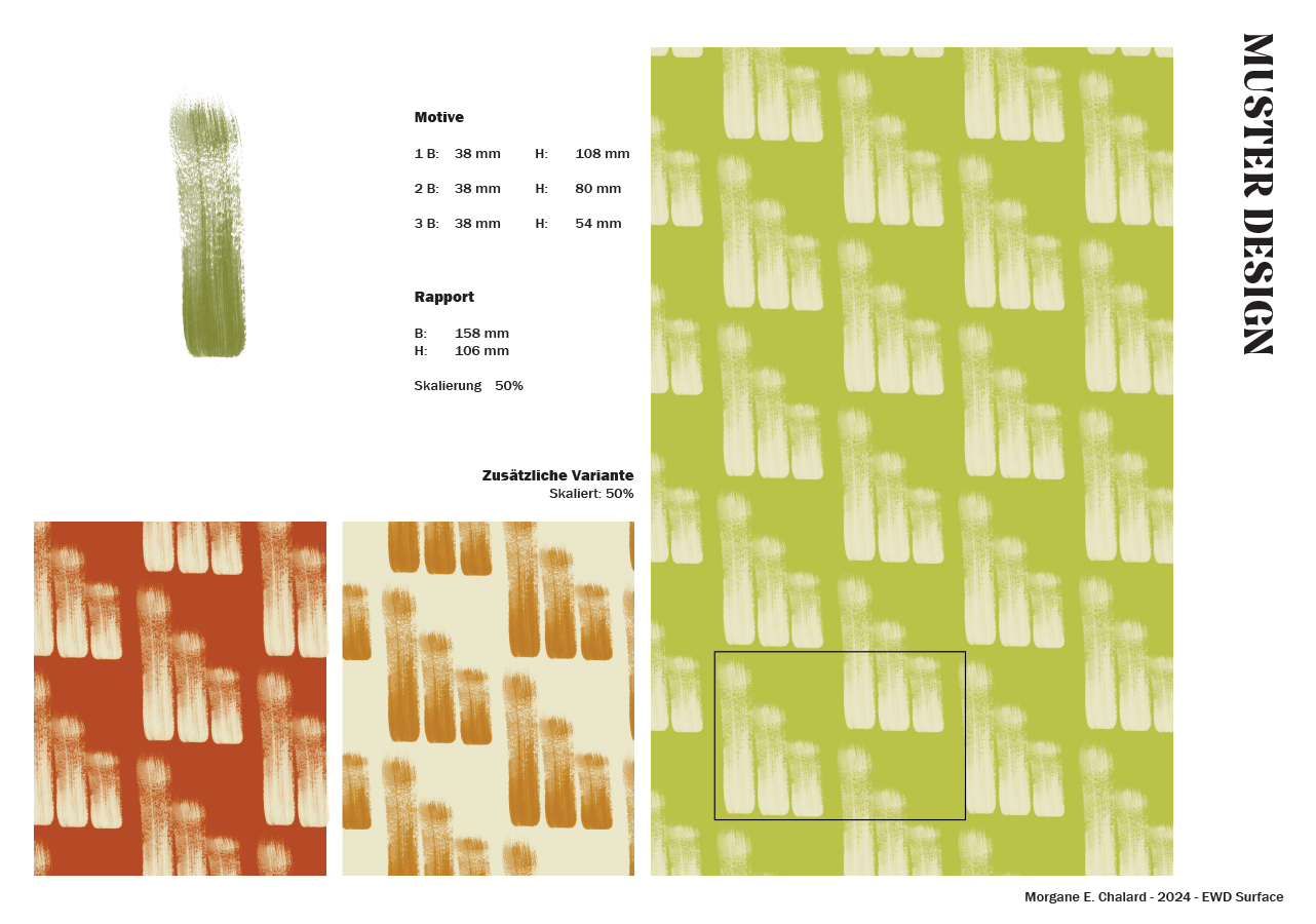
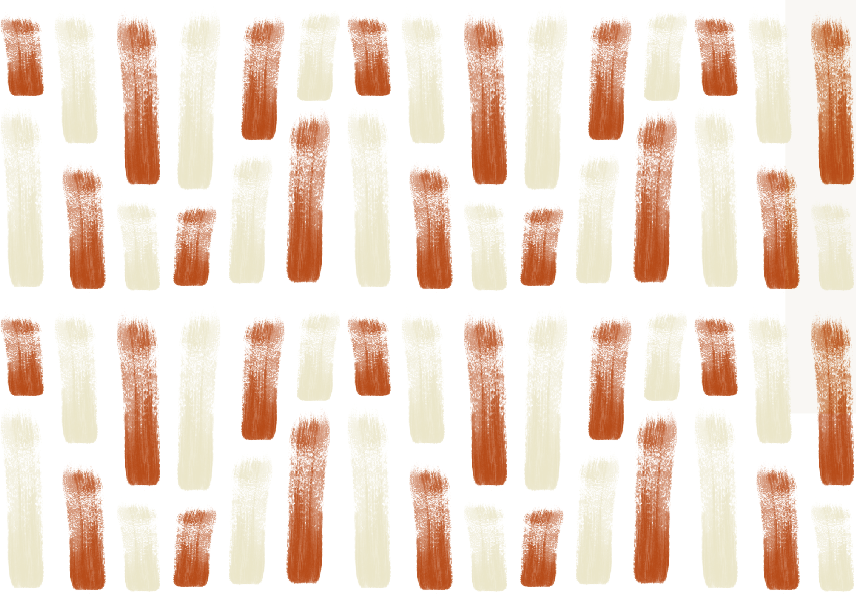
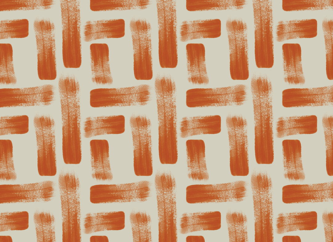
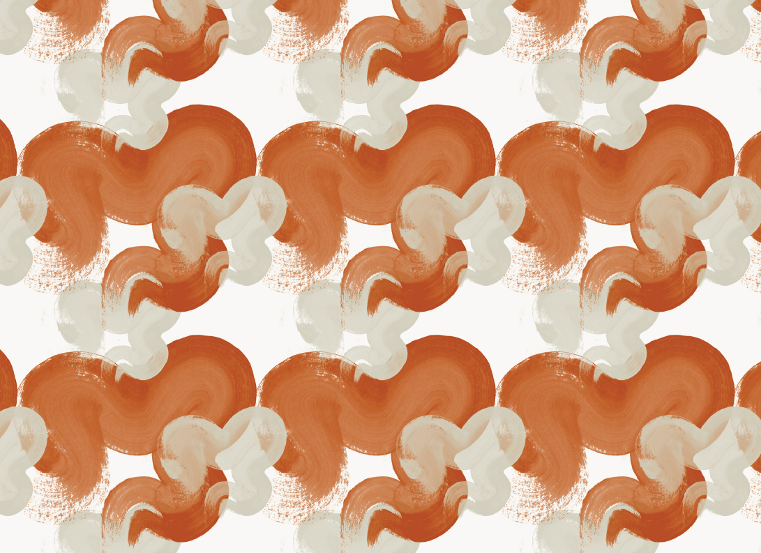
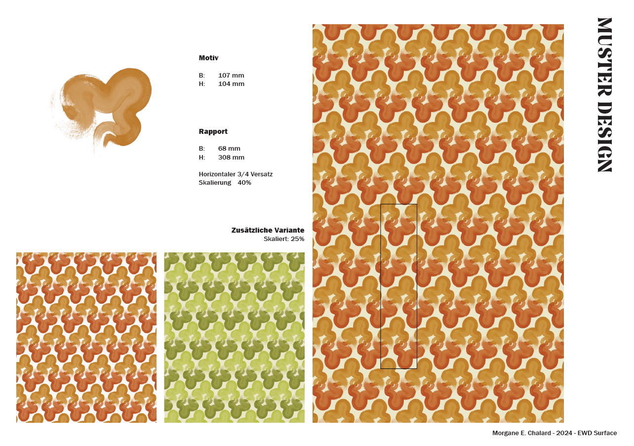
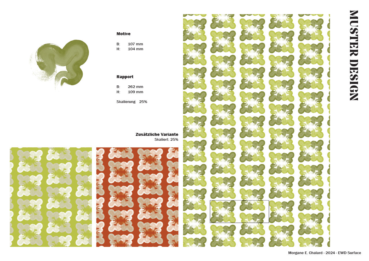
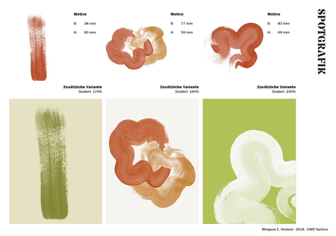
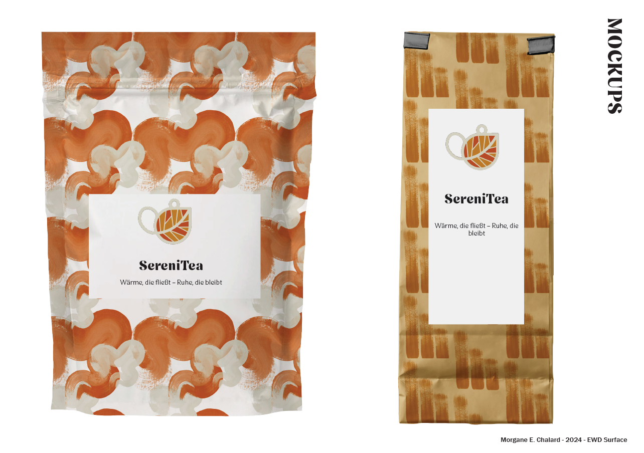
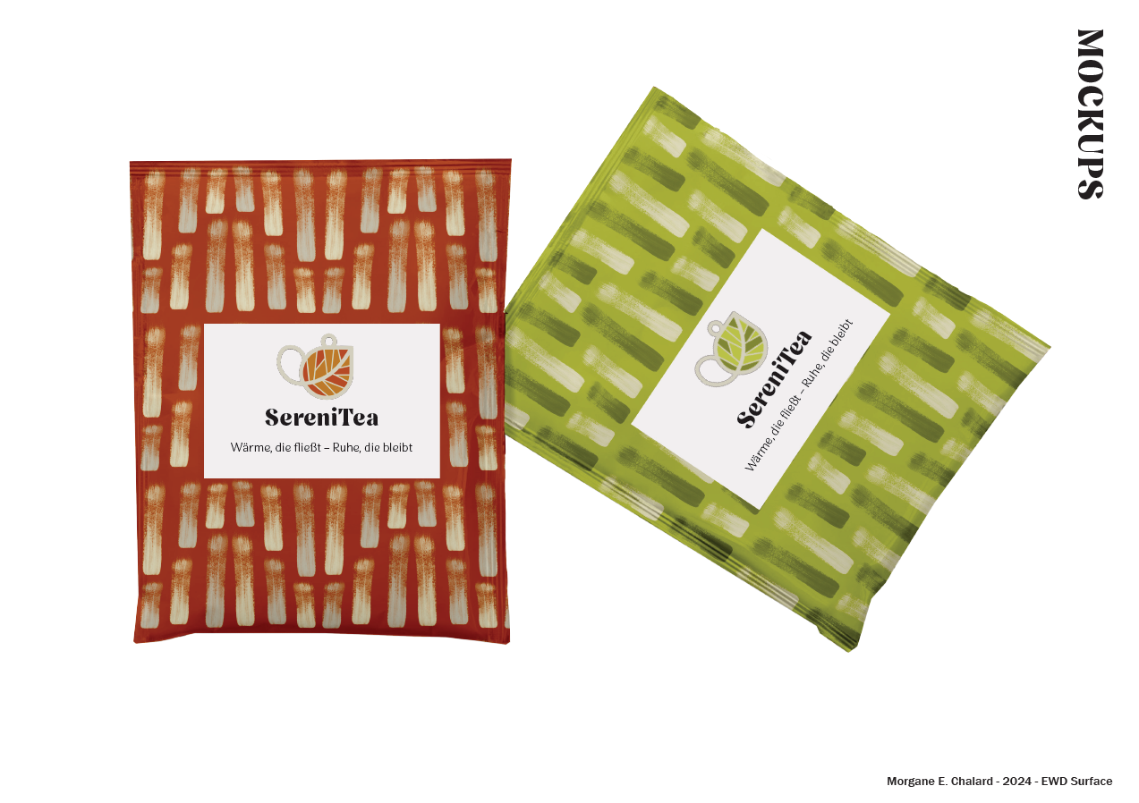
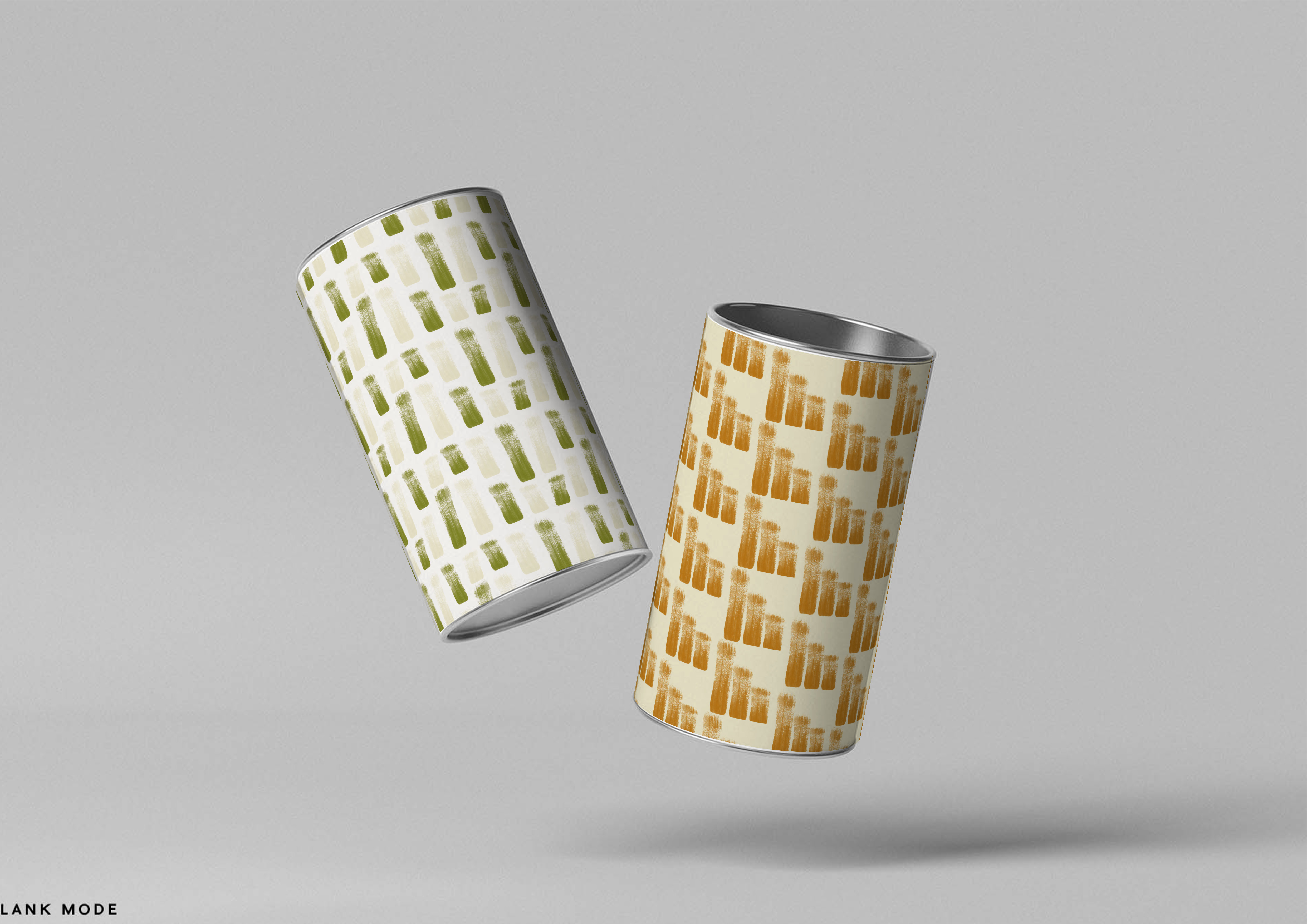
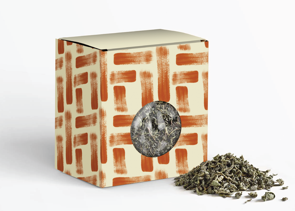
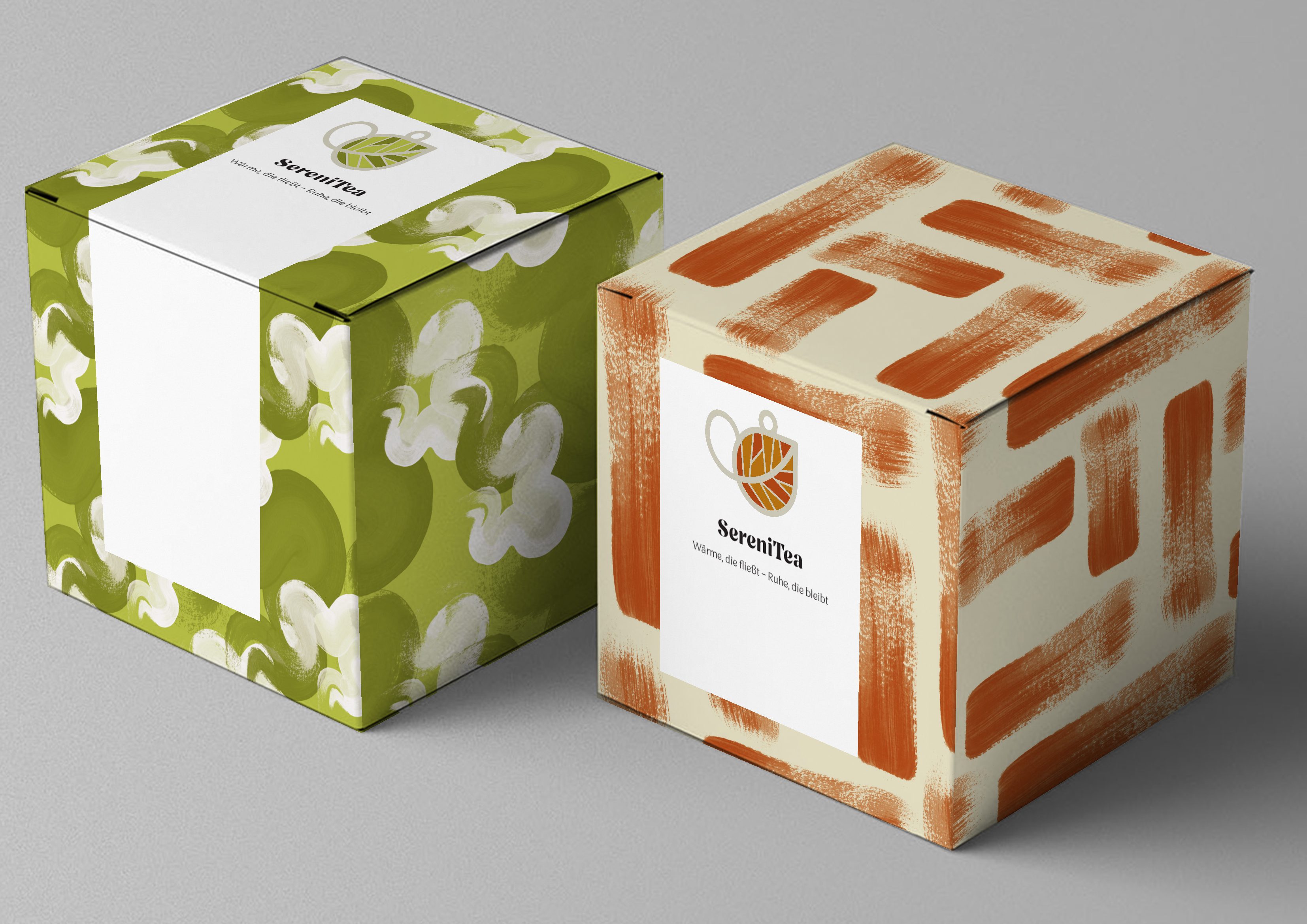
This is a pattern design for tea packaging. To create the design, I used three different methods: stamps, materials, and painting. I made several sketches using these techniques, then scanned and edited them in Photoshop. Finally, I created a range of pattern designs in Illustrator, which I divided into two collections.
The first collection is called Lines, focusing on the use of lines in varying sizes to create different patterns. This collection emphasizes structure and simplicity, with the lines representing the clean, straightforward essence of tea. The second collection is called Swirls, which highlights the more organic and flowy aspects of tea. The patterns in this collection are warm and soft, symbolizing the natural flow and comforting qualities of tea.
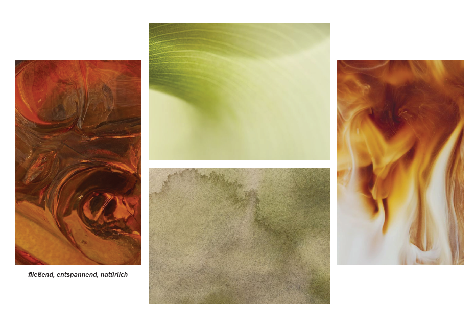
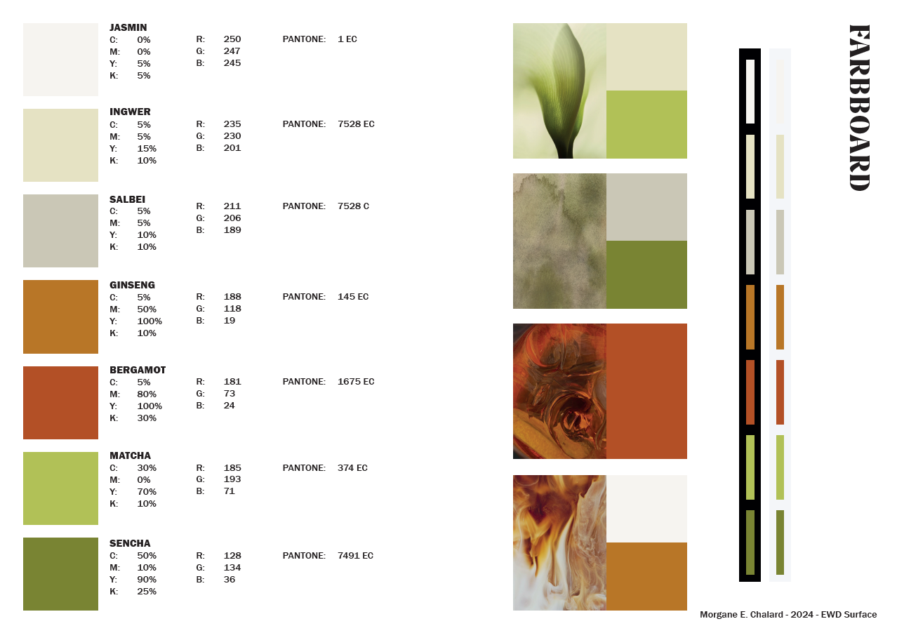
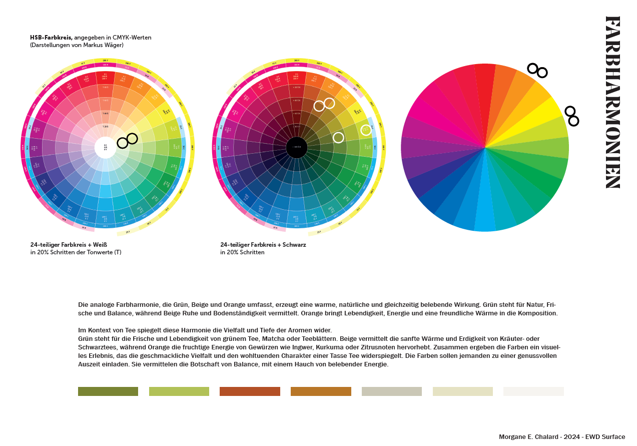
For the color scheme, I chose a warm mix of red and orange, representing the richness of black tea and fruit tea. The secondary colors—green and beige—reflect the refreshing qualities and natural essence of green tea, herbal tea, and white tea. These colors symbolize not only the warmth of tea but also its freshness and sustainability.
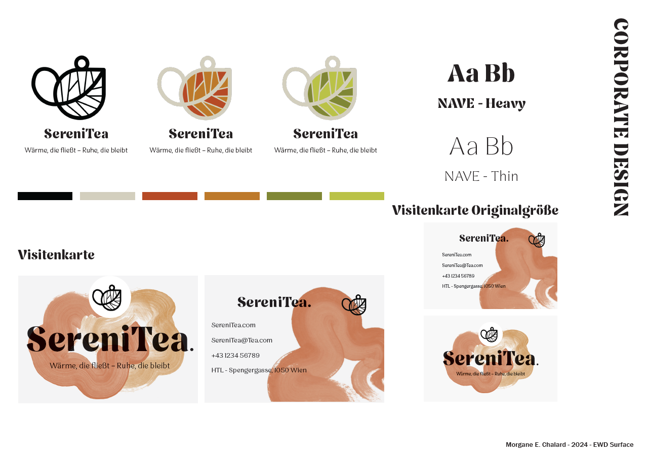
The second part of the project involved creating a corporate design and a company identity, along with mock-ups using the previously mentioned designs to visualize the brand’s look and feel.